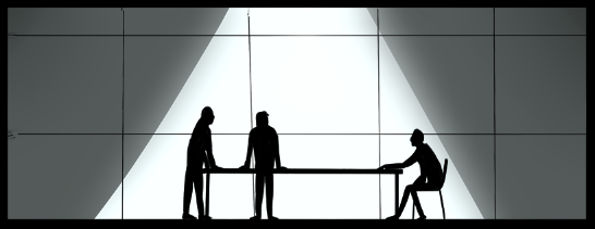
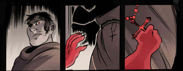
Perfection calls to you
Script by Hugo Boylan
Art and Colours by Lane Lloyd
Letters by Kerrie Smith


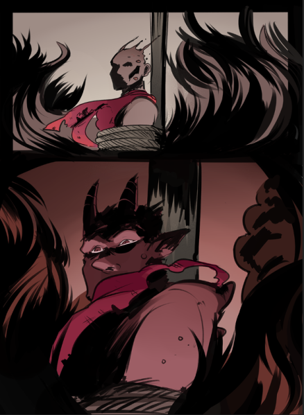
It might break you for a while.
Perfection calls to you
Script by Hugo Boylan
Art and Colours by Lane Lloyd
Letters by Kerrie Smith
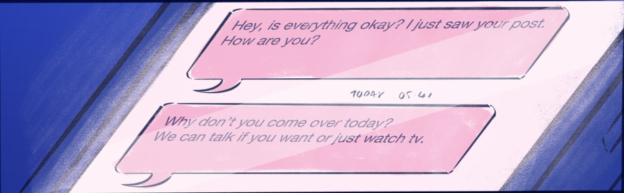
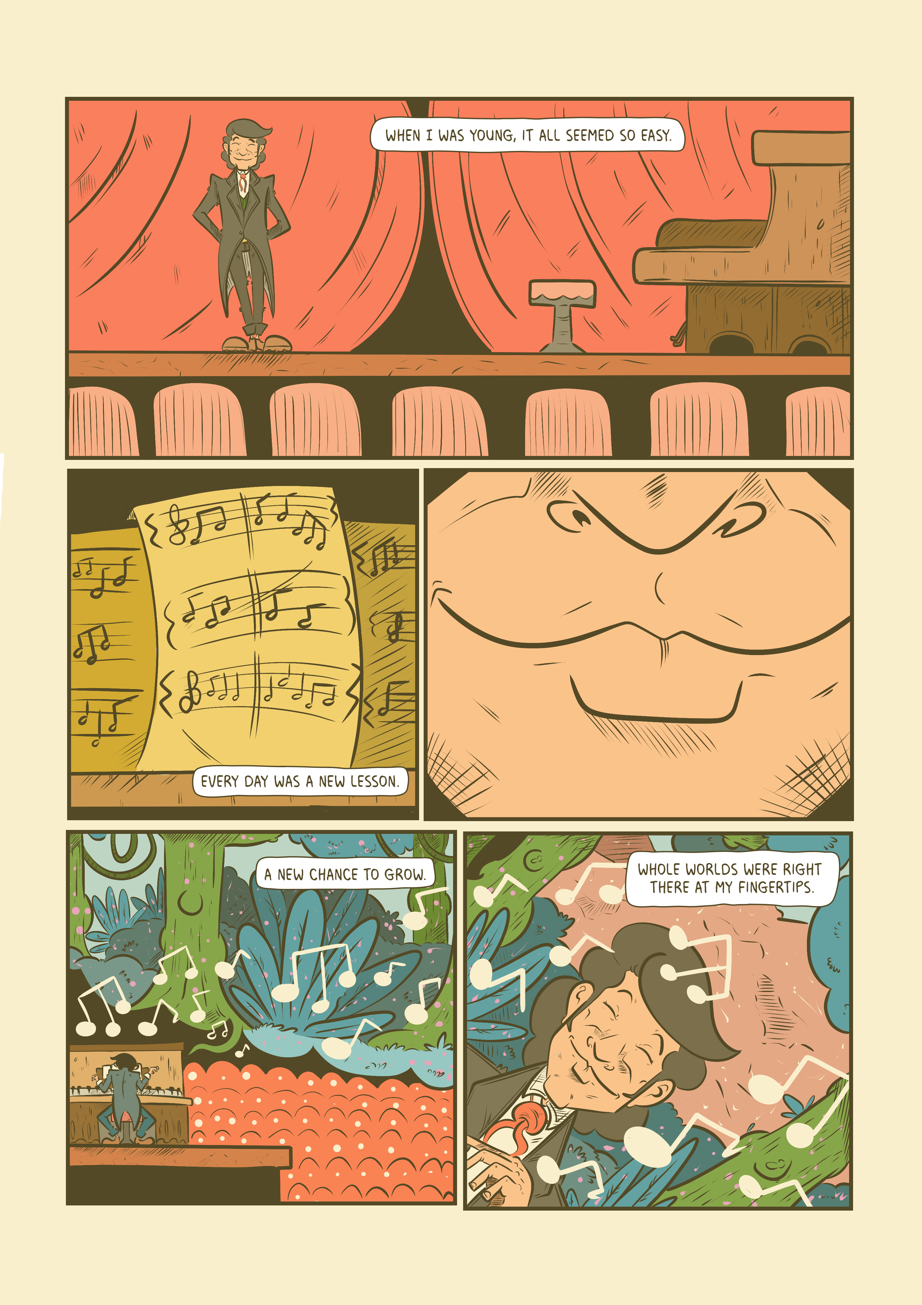
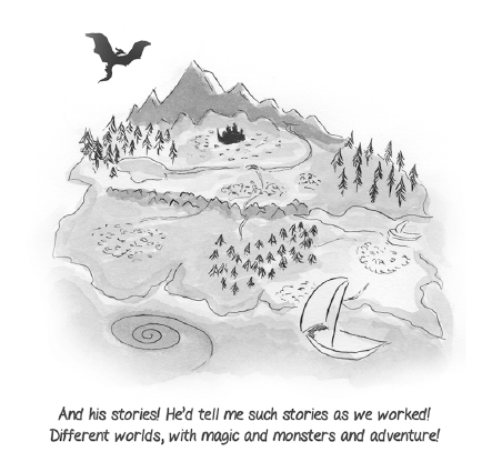
Life can seem like so much sometimes.
Sometime all you need…
Script by Hugo Boylan
Art, Colours and Letters by Rebecca Reynolds


Before we get in to it, LAD has gone live on Kickstarter! I’m going to talk a lot about editing in the context of this book, and it would be amazing if you could take a minute to check out the page, or maybe even pledge some of your hard earned cash so we can make it happen!
In the summer of 2018 I sat down with a checklist of books I wanted to make, people I wanted to work with and shows I wanted to attend. It was a daunting list. The two books at the top of that list were with the same artist, and would undoubtedly be an incredibly draining process for both of us. Not the collaborating, the artist in question is an utter joy to work with (and we’ll get to that later), but the process of writing two vastly different mini-series, for demographics that couldn’t be further apart, each dealing with themes that were definitely going to be a gut-punch for me to revisit. I decided to take a year, neglect this website, take sporadic breaks from social media, cut down my convention list to “special exceptions” (shows like Small Press Day, ComicCity and Cork Comic Expo; the shows that I love because they’re a little different) and decided to clear the scripts for those two series and that would be it. If I made any other comics, or posted any other stories, it would be for the love of the medium, and it would be short.
Right at the bottom of this list, I’d scribbled in a little note for myself: “Umar?“
For a couple of years now, I’ve been following Umar Ditta’s work. We became friends, I look over his early drafts sometimes and give little bits of feedback where I can, and he’s done the same for me. Comics are weird like that. I wanted to work with Umar. His capacity for coming up with energetic and weird ideas knows no bounds, and his dialogue can leave you with a tear in your eye, or have you cry laughing, so imagine my surprise when he sent me a very raw draft for what would become LAD: The Homecoming. Here was a story that was as brutal and visceral as the short stories I keep in a folder on my computer that nobody will ever see. It managed to balance cutting cynicism with sly wit in a way that was just crying out to be turned into a comic, now! This was a book that I wanted to read, but like I said it was raw. The draft I read was packed with caustic dialogue, mind-blurring imagery but moved like a freight train with a blink-and-you’ll-miss-it series of scenes and character moments. Another set of eyes would only improve this narrative, right? Before I could even chance my arm, Umar offered me the editing gig.
LAD has changed a lot from that raw draft. What was initially a jam-packed 24 page eruption of violence, intrigue and distressing surrealism became a 3 issues of careful character development, the implication of danger and some genuinely inspired visuals. So how did we get here?
When editing a Comic Book, it’s not uncommon to be in fairly regular contact with the team, and after sending Umar my initial notes on structure and pacing, we spoke a little bit about how he wanted to tell this story, and how he wanted to effect the reader. These conversations took place over email, messenger apps and eventually, an outline was put together, giving an elevator pitch, and a summary of each issue – as a quick aside, although these summaries did work as a valuable road map for the series, and have helped us to stick to a deadline and work towards the ending with every panel, no battle survives first contact, and comics are rarely the exception. Once I had reviewed this document, I made notes, adding them to the footnotes section of the relevant page for easy reference, and wrote a few short paragraphs of feedback under each issue.


This can be a surprisingly fast process, and in the case of LAD, I was looking at the first working draft of Issue 1 in about a week. Once I have the script in front of me, I’m able to do the basics (like reading it, natch), checking the dialogue (making sure it all flows well and fits in each panel without overwhelming the page), panel counts (how many panels are on each page? Is there good variety?), action in each panel (making sure single characters aren’t performing multiple movements in a panel description is a must!), clarity for the artist and letterer, mapping out page turns, all that good stuff.
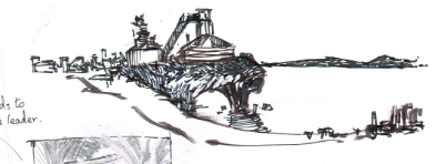
LAD has undergone one main change from the initial draft to the working version we used to make the first issue of the comic. As I’ve mentioned before the raw draft of LAD had a lot going on – too much to really allow the characters to breathe. In order to combat this, a full story pitch was laid out, highlighting the necessary action in each issue. When we had this in front of us, Umar and I were able to discuss at length how to improve the pacing of the issues. The answer was fairly simple, open hot and spread the story beats over multiple issues. In addition to this, in facilitate running multiple narrative’s simultaneously, Umar added a “cold open” to the beginning of each issue, focusing on a character or action that will prove important to the plot later on. Below are the original and current drafts of LAD Issue 1. Although we managed to reuse most of the original opening scene as the titular Lad’s introduction later on in the book, it’s interesting to think that adding a full scene to the start of the issue actually managed to improve the pace of the story.


After reading the script and making some notes for myself, I then make notes on each page for how the writer might change the panel descriptions and dialogue to give the artist a better idea of what they have in mind. Below is an example of what those notes looked like on an early draft of Page 1. 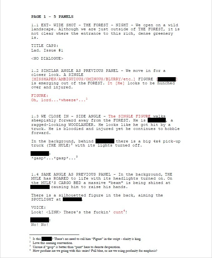
In my notes above, I suggest that the writer name THE SINGLE FIGURE immediately after introducing him in the script. It’s always best when working with a team to have as clear an outline of what’s happening in the script, even if that makes some of the panel descriptions run long. While it’s not likely to happen, the artist may end up redrawing an entire panel if they initially outline the wrong SINGLE FIGURE, or they may end up working from the wrong character design. What’s more likely to happen however, is the letterer (who is typically the last person in the chain when in comes to comic making), already pressed for time will have to double check they’re lettering the correct character. That’s not ideal if you’re under pressure to meet a deadline.
On a project like LAD where the writer is also the publisher, most of my notes can be taken as suggestions. When working as a professional in the industry, the editor usually has final say on what stays in the script, but at the independent level there’s far more discussion and collaboration. Fortunately Umar and I tend to get on the same page quite quickly, and for the most part I find when he chooses to go against my notes, it’s with good reason (and often to build to a killer line from my favourite character in this series, First Cousin). Sometimes a suggestion from an editor can lead to a much better choice from the writer, as seen in the dialogue change in Panel 5 of Page 1.


This process is repeated through multiple drafts, until both writer and artist are satisfied. It should be noted, if you’re working to a tight deadline, or on multiple projects, going through too many drafts can be strenuous for both writer and editor, and that’s why having a solid outline and issue breakdown is vital to ensuring you’re always working towards the same goals and the betterment of the book.
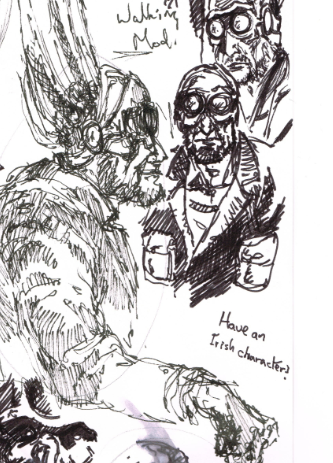
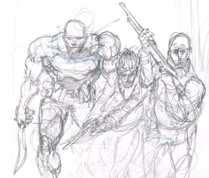
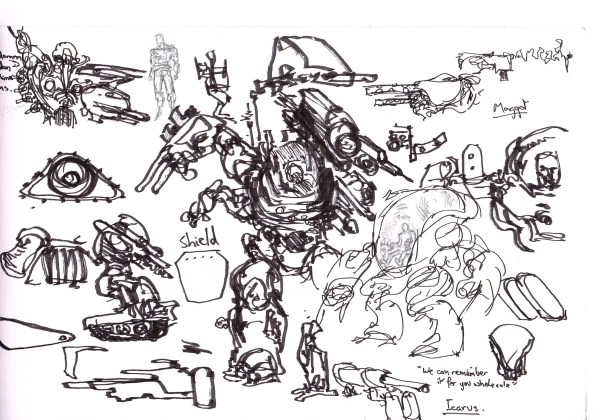
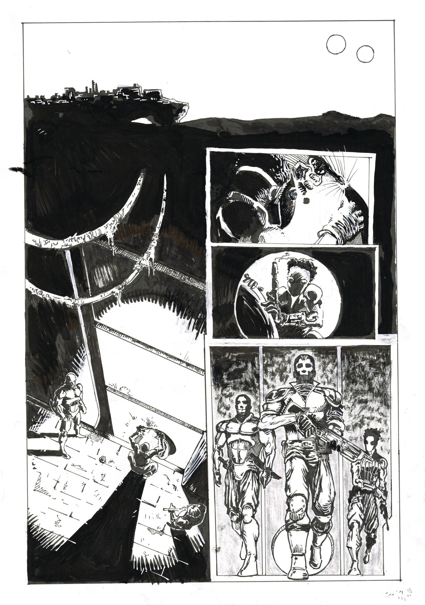
Comics are a visual medium, and with a book like LAD, that balances dark and moody shots with mind melting surrealism, you need to find an artist who can bring out the best in the script while adding their own unique voice to the narrative. Our search for the perfect artist was exhaustive. Umar put out a call for portfolios on social media, I scouted friends and past collaborators to see who would suit the book and how they would approach it. This was honestly the most difficult stage of creating LAD for me. When all was said and done we were down to two artists. One, an exciting, dynamic and smart cartoonist, with a style that can range from Saturday morning, to Adult Swim, and the other, a methodical and experienced comic book artist with a wide rage of styles, a focus on expressiveness and aggressive inks. I think narrowing it down aged me five years, but in the end we went with Carlos Pedro.
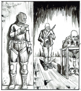
Carlos had just (and I mean earlier-that-week just) finished the inks on a book he and I had planned to pitch later this year when I mentioned that Umar had a great script that I was editing. Carlos wanted in. He has been a supporter of Umar’s for a long time, and once he saw the script, he wanted to be the one to draw it. Before he touched his first layout, he treated us to his vision and concepts for the book.


And what he envisioned for the characters.


The design work on the aesthetic for the book and the characters took Carlos about two weeks, while receiving feedback first from myself as an editor and after I approved of an image, it was sent on to Umar to give his final nod as the publisher.
Editing for the artist works in a very similar way to how it does for the writer, with a few notable differences. The first, naturally, is that you’re dealing with images instead of words. While this might seem like a small enough thing when it comes to giving feedback, it is vital to ensure there are no mistakes in simple things like spacing in the panels and dialogue order (the first speaker is always on the left) in the layouts/thumbnails stage. One small miss here can literally make the letterer’s job impossible and cause massive last minute rewrites to a finalised script to avoid huge delays and a massive headache for the artist who could have to redraw and entire page. It’s not uncommon for my first reply to Carlos when he asks for feedback on a new layout to be “how’s the dialogue order?” or “have you accounted for dialogue?” I’m lucky that Carlos is a meticulous planner and can generally be relied on to answer “of course”. From there I check for aesthetics and storytelling. It’s important that the page structures aren’t too samey as you read a comic. Unless it’s done for a narrative purpose, it runs the risk of boring the reader. The same is true of “shot” choices. If every panel is a middle distance shot of a character doing something while talking, it can become a very tedious read, however good the writing or art may be. Below is a process from sketch to finished page that Carlos worked on with my feedback.


")

")


")
")
While it’s not typical in comics for an artist to send this many steps through to an editor, as Carlos and I have worked together for a few years at this point, we’ve worked out a method that works for us. Typically on the steps in between the blue line sketch and finished pencils, I would give general feedback on character placement, movement or expressions in one or two sentences. Beyond that my function is pretty much one of a cheerleader until we reach the final pencils. This is the last point for any effective editing to be done when working traditionally (paper, pencil and ink). Once the ink touches the pencils, that’s it, so if there is anything that really stands out as not working in the pencils, or that might not work when inked, I’ll bring it up here. Fortunately, Carlos works digitally. This means that changes can be made well in to the inking stage, and while this rarely happens (it’s good to get in to the habit of editing at the layout stage, and having a final proper look at the pencil stage), it is nice to have that breathing room.
There are very few occasions when I will push back against a page. Fewer still when it comes to a splash page, but when it came to the title page for LAD, Carlos and I struggled to click.


The first point of contention was whether or not it would be too on the nose to have Lad smoking, under a “No Smoking Sign”.

What about his body language? This is our first introduction to the title character, and we wanted to capture him perfectly. Should he stand with his hands in his pockets or lean against… that bloody fence (I was very against the fence).


Finally (and I mean finally, I think poor Carlos may have spent more than a day trying to get my idiot editor brain to understand that leaning was in fact the correct body language to capture Lad’s overall demeanour, while still introducing what is to be a pretty intense scene), we settled on cutting the “No Smoking Sign” (boo) and to show Lad leaning (yay) against a post while smoking.
(And yes, I know the “No Smoking Sign” would have been on the nose, but out first introduction to Odysseus in the Odyssey shows him weeping openly on a beach, devastated by the separation from his wife, brushing aside his own infidelity in that instant to allow the readers to feel an immediate sympathy for him, so yeah, it could have been fine, OK?)


Once we were agreed on what our title page should look like, Carlos set to work inking what I think my be my favourite expression of Lad’s in the entire comic.

")
")

While this process may seem like a long one, my role is generally to catch any glaring storytelling mistakes that the artist may miss while they’re in the zone and focused on making the best looking page they can. Arguments like the one highlighted above could only really happen when you work with someone as much as Carlos and I have, and are both fighting to make the best book possible.
As I’ve mentioned before, the letterer is typically the last team member to get to work on a page, and they’re usually the one (Carlos not withstanding) an editor will have the most contact with, barring the writer in the early stages. When deadlines are approaching, you want to make sure everything is OK, and more importantly, you need to keep the line of communication open between you and the person whose work will be the first thing a reader sees when they open up the comic to any given page.
I’m in the habit of keeping letterers in the loop from day one. I want them to have access to the final pencils and inks as soon as they’re approved. Even if they have to wait for colours to begin actually lettering the page, having the page laid out in front of them allows them to do any preliminary work they might have to do. This is doubly true for the letterer on LAD, Kerrie Smith – we share an office.
When starting a new book a letterer will first try to match a font and the weight of the word balloon to the art and inking style. They may also consider the type of story it is. For LAD, a happy-go-lucky, or overly rounded font wouldn’t fit the tone of the book, while the crooked font Kerrie went with here works a treat.
When choosing the right font and balloon weight, the letterer may send a few samples to the editor, writer, artist or the team in general to feel out the room and narrow their final choice down. Once a font is selected, they will set to work on lettering the page, being sure to guide the reader’s eye from panel to panel, while trying not to obscure anything important in the art. This can be extremely challenging, and it’s not unusual for the editor, artist or writer to ask for fixes to be made before going to print. Unlike scripting and art, there are no “rough drafts” for lettering once the font and balloon styles have been selected, so it’s vital for the writer to be clear in the script with how they want a scene to read, and if there are any important objects in the panel that cannot be obscured. It’s unusual for letterers to be paid a second time for doing corrections that have been requested by another member of the team, so it’s important to remember that every time they have to rework a page, a panel, a scene, or in some cases a whole comic, they might just be working for free.
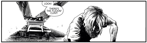
Fortunately this is rarely the case for me when I work with Kerrie. We do share an office after all, and it’s common practice for her to bring any concerns she has about the script or pages to my attention long before she starts work. This way we can determine what (if anything) has to change or be rewritten to make sure the pages will still look their absolute best once all of the writing is in place. When working on LAD, we did have one instance where a page had to be re-lettered before going to Kickstarter. After seeing all of the pages with all of the lettering in context, Umar realised that Carlos’ artwork for that page was dramatic enough to stand with minimal lettering. The original page featured a line of dialogue “Oh lord… <wheeze>…” followed by THE SINGLE FIGURE “gasping”, or “panting”, and a final exchange with THE SINGLE FIGURE shouting “Oh heaven’s above! Save us!” only to be answered by “Ya no getting away ya daft prick!”. After seeing all of this on the page, the writer felt (correctly) that the scene would flow better with less dialogue. Unfortunately, the original image that was featured on the LAD Kickstarter Page before being replaced has been lost. There was however still a discussion to be had about whether or not THE SINGLE FIGURE’s gasps and panting should be vocalised.
")
")
")
Ultimately, Kerrie felt that while dramatic, having THE SINGLE FIGURE vocalising so much would detract from the tension of the scene and suggested a solution that would become our final choice for Page 1, removing all but the pursuers aggressive proclamation of “there’s the fucking cunt”.
Ultimately when editing for comics, your jobs is to facilitate the other creators and to foster an open line of communication between all parties. Yes, you proofread scripts, you check for the quality of storytelling and pacing on the page. Yes you have to make sure the artist leaves room for the letters, and that the script isn’t overburdened with dialogue that a letter will then have to cover the art with. If a comic calls for colour, you need to make sure the colours work thematically and that the script details the time of day (so very important). Yet with all that said, you still have to focus on deadlines, production and communication. If any of these break down, it’s not the fault of the team member who has fallen behind or failed to respond to an email, it’s on you to make sure if there are delays, and nobody down the chain can help catch it up, that the deadline is moved, that everyone feels like they have a voice and can voice their opinion and most importantly, it’s on you to make sure the final product that makes it to print is the best version of that story.
Well, to find that out you should check out our Kickstarter Page!
But I guess I can give you a little taste here before you do:
Taking inspiration from neo-noir films and comics, Lad is set in a world that is similar to ours but yet feels hauntingly different.
The Family conduct their criminal activities from the Beacon Lodge. They have been for a while and everyone one knows that the town belongs to The Family. There is however one place where no Family Member would dare set foot: The Forest.
Engulfing most of the town’s perimeter, The Forest is home to a mysterious entity known only as The Hermit. For as long as Lad can remember there’s been one mantra in The Family: leave The Hermit alone and The Hermit leaves The Family alone. So why was Dad, the patriarchal leader of The Family found savagely beaten and barely clinging on to life just outside The Forest?
In The Family’s eyes this is an act of war. An act of war that sets in motion a series of events that will change everything for Lad, forever.
And did you know that some of your favourite comic creators love LAD?
“A bleak and bloody British revenge thriller in the proud tradition of ‘Get Carter’ and ‘Dead Man’s Shoes’. Unmissable.” Alex Paknadel – Friendo, Arcadia, Kino
“After ‘Untethered’, Umar Ditta goes from strength to strength with ‘Lad’, a level-up showing from everyone involved.” Fraser Campbell – The Edge Off, Alex Automatic
“I love all of these people, so for them all to get together and produce something less than incredible is inconceivable” PJ Holden – Judge Dredd, Terminator/Robocop: Kill Human
“Taking distinctly modern street violence and merging with old folkloric horror mode is just inspired, and it looks brutal in every way.” Kieron Gillen – The Wicked + The Divine, Die
“A dark, urban fantasy with a thick layer of grimy menace.” Dave Cook – Killtopia, Vessels
“Carlos Pedro is always an artist to watch, upping their game with each new project. Here he is, yet again, bringing something exciting and new, his noir lighting and textures a perfect compliment to Ditta’s narrative in Lad.” Hassan Otsmane-Elhaou – Panel x Panel, Strip Panel Naked, Killer Groove
“Everything I’ve seen of Lad is fascinating. So far it’s a strange, sideways item, all gorgeously creepy shadows and little moments of nasty, just beginning to fold together into something deep and disturbing. I want more – you should too.” Al Ewing – The Immortal Hulk, You Are Deadpool, Loki: Agent of Asgard
For a full 5 Page Preview of LAD head on over to the Kickstarter Page now and let me know what you think!
Keep reading and writing… and drawing and lettering… and colouring and designing… and marketing and budgeting… look just keep up the good work everyone!
Hugo
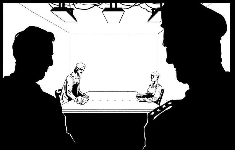
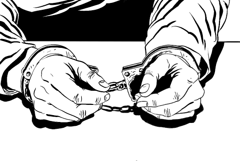
Crime. Betrayal. Love. Hate.
It should have been an easy job. Snatch the goods, get to the car and get the hell out… but then the cops turned up and everything went straight to hell.
Damnit Hanratty, what were you thinking?
Script by Hugo Boylan
Art by Matt Shiell
Colours by Meghan Ryan
Letters and Design by Hassan Otsmane-Elhaou


With the Referendum on the 8th Amendment to Irish Constitution looming on the horizon, I wanted to share some thoughts with you all.
Ireland’s constitution is a bit of a mess. In fact it has been for a long while. We don’t really use it as a broad guideline on our little island, but rather seek to change laws and habits by adding to and taking away from our constitution ad nauseam. The 8th Amendment should never have been a constitutional issue and it’s essential that it be removed in the upcoming referendum.
There are those who would have you believe that with the repeal of the 8th, Ireland will cease growing. There is a narrative out there claiming that “1 in 4” Irish women will, when given access to safe abortions, terminate every pregnancy. I shouldn’t need to tell you how false this is, but I will. An estimated 163,000 women and girls have left Ireland to have them between 1980 and 2014. One hundred and sixty three thousand. In 2014 over 1,000 “abortion pills” were seized by Irish Customs. It’s clear that any woman who needs an abortion is willing to circumvent the system, and while those numbers are staggering, it’s far less than “1 in 4”. Still Irish women are putting their health on the line to travel and seek out a service that must be made available at home, and so long as the 8th remains, we are complicit in that.
This is not simply a political issue. This isn’t a line in the sand to be drawn between “traditional” and “liberal” values. This is about the human rights and the dignity of Irish women. It is disgraceful that for years Irish women have been driven out of this country in search of basic medical treatment. It is shameful how we as a nation have tried to hide and forget about them. Now is the time we can stand together and make a real change and make Ireland a kinder place for women going forward.
On a final note, the disinformation being spread anti-choice side, by the goons in the Iona Institute and their ilk, is nothing new. In 2016 Tree Farrell and I put together a short comic for the MINE Anthology both to support the Repeal movement and to lampoon the tactics of misinformation and exaggeration being employed by so many on the anti-choice side. I would of course encourage you to to read the comic and vote for repeal, but please do that the time to read around this issue come to your own conclusions. I only ask that you stay wary of misinformation and bad faith campaigners.
If you want more information on the referendum or the 8th Amendment, I would recommend checking out both the Coalition to Repeal and Amnesty International
#RepealThe8th


Comic projects can fall apart at any stage and for any reason, but it’s so important that you embrace these failures and learn from them.
Making your own comics is rewarding work. There is a unique freedom to try new things, to experiment with the form, to look at strange and uncommon themes and settings. You can tell stories for yourself, for your friends, you can make a statement or you can examine the human condition. You can just do you. That feeling you get when you see your script brought to life by an artist is one that can only be described in superlatives. I’ve made friends for life through my collaborations, I’ve seen these friends go on to succeed in the industry in ways that fill me with an irresistible mixture of pride and jealousy. The knowledge that we all started out writing, drawing, colouring and lettering our own work, that we all grew from that same garden is at the same time comforting and bizarre. For all of this though, there are so many pitfalls, delays and disappointments that we as creators need to deal with on an alarmingly regular basis. Oftentimes when you come up with that one great concept, the one that, to you, is going to make all the difference, you believe in it so fully that the idea that anything will go wrong is completely alien to you. You can invest time and money, heart and soul into that comic. You can do everything right, but it can still fall apart.
For all the individual work we do and for all those hours we put in, as a writer comics will always be a collaborative effort. For all that we create, and no matter how hard we try, comic creators are still human. Our collaborators are still human. Life can get in the way. I’ve written dozens of scripts that may never see the light of day. I’ve worked on so many projects that have seen the opening pages drawn and even coloured before something comes up – a collaborator is going through a rough patch and needs to take some time off, maybe they land their dream job drawing a comic they love or maybe it’s something as simple as time running out. It can be disheartening and it can set you back, but it happens. The important thing to remember is that, even though the setback can hit hard, we don’t have to get knocked down. We can keep our feet, grit our teeth and look to the next project.
Idiots in Space! Sounds like fun, right? Back in 2013 I really wanted to turn my hand to sci-fi. I had an idea for a crew of bobble-headed dopes, blundering through space and not really achieving anything. I wanted to satire the Five Man Band trope and write some ridiculous adventures. Turns out I was wrong.
Before scripting began, the idea was wriggling around in my hands and morphing right before my eyes. I hooked up with a friend and fellow writer Dermot McDermott and my long-time colleague from the Superhero Help Desk webcomic Kerrie Smith, to bounce ideas off of and within an hour of our first burger-and-banter, The Good Ship Mary Sue and her crew of hapless buffoons had been replaced with a deep-dive in to philosophical cyberpunk, frontier sci-fi and a healthy dose of political metaphor.
Even now thinking back on those early meetings reminds me why I love the collaborative process. The exchange of ideas was electric, suddenly we weren’t just going to do the Five Man Band, we were going to subvert it. We weren’t just going to do another frontier sci-fi, we were going to draw from Irish history and politics to create a lived in and deeply antagonising universe for our characters to inhabit. We didn’t want to settle for cyberpunk, we wanted to create an elusive, transhumanist pseudo-religion. I think you can tell this was an ambitious behemoth for any book, let alone a first graphic novel from three non-artists. Still we persevered, drafted a timeline of key events, and wrote extensive backstories for the political factions, key figures and of course our band of not-quite-heroes.
It was with these ideas still raw that we happened across artist Matt Shiell. Still in college, but looking to break out of fine art and in to comics, Matt approached the opportunity to work on this nebulous book with an attitude and enthusiasm that matched our own over-confidence in what we could do. Favouring a darker, inky style and relishing in the use of negative space, Matt was going to bring a brooding melancholic atmosphere to the artwork in a way that would play up to the darker elements of our narrative. We were on a roll, and yet with all of this in place, we couldn’t stop. We kept pitching ideas. With the four of us now fully ensconced in the universe we just couldn’t help ourselves. We wanted frantic action and head-turning mecha designs. We needed to add more to our bounty-hunting quintet! More cybernetic augmentations! More political allegiances! More drama and more tragedy! Where once the political backdrop would have played out in the periphery, now it was taking centre stage. We needed another scene to show why the No-Mod terrorist group X-Machina might actually be justified in their actions, but then we’d have to balance that out with a few scenes juxtaposing the utopian cyberpunk cities with the dusty and brutal frontier. Twenty four pages wasn’t going to cut it anymore, we needed to do a double sized first issue! No, never mind, we’d just ditch issues altogether and shoot right for the OGN! What could go wrong?
Ultimately, time ran out. We’d set ourselves a strict deadline. We had to finish the first act, if not at least an ashcan by DICE that year. Working within that limited window seemed like the only way to get our work on track and still allow the various teammates to continue on with college, day jobs and other projects. With that deadline looming ever closer, it became apparent that we’d never have time to get the book done. Tensions were running high within the team – we didn’t give Matt enough time to finish his concepts and the artwork, Dermo had to get back to the law library and finish his essays for the semester, Kerrie was working forty hour weeks and managing a webcomic, and I had started work on an all-ages fantasy series that needed my attention if I was going to get the first issue written in time for it to see print for that same convention. Our last meeting didn’t go well. It was clear we didn’t have it – couldn’t do it. We couldn’t get this book finished and all of those hours were going to be wasted. None of us reacted particularly well. What’s the matter? Hadn’t I done my work on time? The script was finished after all; it’s the art that was late. Of course it wasn’t as simple as all of that. Yes, the art was late, but this was Matt’s first comic and he, correctly, had wanted to ensure his designs were finished before barrelling in to the sequential work. But why didn’t he tell us earlier? Well that’s probably on me. I’d taken on a de facto leadership role in spite of my best efforts, and hadn’t pushed for better communication. Speaking to Matt recently, he pointed out that he’d felt ashamed of not being able to finish the work on time and didn’t want to let the side down. He’d felt that admitting he needed more time might have made the team see him as disorganised and unable to deal with deadlines. That pressure might have caused him to buckle, but better communications all over could have mitigated his worry.
So it was with frustration that we all agreed to part ways, foisted by an overly-ambitious project and deadline, with nothing to show for it but a good first draft of the first page of what could have been a great first OGN.
When I find myself thinking back on what we lost, both in the Space-Buffoonery of the Good Ship Mary Sue, with her giant cook and his giant couscous and the heady misanthropic world of Bountech/SOBEK/whatever-our-final-title-might-have-been, I feel an uncomfortable rush of mixed emotions. I loved those stories, both of them and I don’t think I’ll ever truly be rid of the latter, but I learned so much. I took from that project skills that would follow me in to future collaborations and help me improve as a writer and as a collaborator. I set my sights on more manageable projects. A six-page sci-fi/horror here, a twenty-odd-page noir fairy tale there… and I never let communication on a live project suffer like that again.
Following the story of Reegan the narrative of The Clockmaker’s Granddaughter would have been split in to two sections. First focusing on Reegan’s adventure after she was transported to a lush agrarian fantasy world at odds with the encroaching techo-magical cities who threatened to destroy it’s natural beauty and balance. Secondly it would recount the story of her Grandfather, the Clockmaker. The Clockmaker’s section would have been told in flashbacks by the characters Reegan met on her journey and would tell of how his grasp of clockwork mechanics had allowed him to bring a refined control to the techo-magic in a great war that had upended the old ruling class and established a new Oligarchy of the People. As the story unfolded however, we would learn that Reegan’s Grandfather had unwittingly installed a tyrannical maniac on the throne. Creating a religion based on techno-magic and obsessed with the return of his old friend from Reegan’s mundane world, the king would stop at nothing to attain more and more powerful and refined devices powered by clockwork-magic.
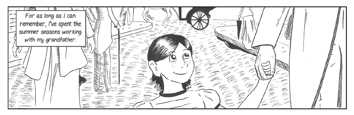
Teaming up with Iuli Niculescu on this project was going to present an interesting challenge. As the story was equal parts her ideas and mine, we decided that the best way to handle the script was with a highly collaborative approach. Rather than full scripting, I would break the story in to scenes. We would then discuss the layout and suggest page count for each. Following this I would begin writing a very loose script, focusing on dialogue and a brief description of the action we should see on each page. Iuli would then take an almost editorial role, dissecting the scenes as they came in, suggesting changes and sending them back to me. This worked well initially and I believe that for the first twenty pages of scripting, the collaboration was a success and we set a good pace for the story. Iuli chose an expressive style, reminiscent of children’s illustration treated with an ink wash to add depth and mood to each page.
CMGD was doomed to fail. Not through any fault of the narrative or the art, but the collaborative style. Working in this way was too alien to me at the time. Iuli favours art-first storytelling and is at her best when crafting the movement on a page. In essence, my job became less about writing a comic, and more about pacing the scene changes, pitching visual elements and guiding the narrative. While it was initially exciting to place myself so far outside of my comfort zone, writing the script in a quasi-“Marvel Method” caused my focus to slip. It didn’t take long to see that without scrapping already finished art and undergoing full script rewrites, we were going to go well over our page count and far beyond our deadline.
Working this way for the very first time on a long form OGN was a slow poison. It was nearly impossible for me to tell the story we wanted to tell. I felt I had to double and triple check every single page- every narrative element as I wrote them. I would stop myself from writing ahead, until I received feedback from Iuli. This led to a breakdown in both our deadline and the narrative pacing of CMGD. Elements were added to enrich the setting, but essential character moments were glossed over to fit the page count we had allowed ourselves. In the end, when the final draft of the script was put together we both knew it wasn’t good enough. We’d lost our focus on Reegan’s personality and had instead presented her as a flat character, swept up in a strange and magical world. Our villains had gone from complex and terrifying to outlandish and at points cartoonish. Even our “epic flight” was wasted, rushed through in half the space we’d initially envisioned.
We had overreached. We had expected too much of ourselves. Iuli for her part had other, more manageable projects on the horizon and the CMGD was no longer representative of the art style she was pursuing. I was just burned out on the narrative. I couldn’t make it fit and I knew it was unfair to ask Iuli to scrap her work and let me start the script over. In the end we could only shrug and say “maybe next time.”
Although CMGD may have fallen away like so much broken glass, I took a lot away from the experience. Time management and confidence in scene building are crucial when collaborating in any form. Better still, I actually write in that pseudo-“Marvel Method”, describing a scene loosely with a suggested panel count and dialogue beats, as opposed to full scripting, going panel for panel and marking out the movements of the page precisely, when working with Carlos Pedro. I can honestly say, without this learning experience, I’m not sure I would have been able to find right balance.
We all have that one idea. The story we can’t shake. The one that we still think has legs. You know, the one that we might actually get back to… someday.
For me that story is Mr. Marlow.


Tríona Tree Farrell had just finished up her season on the SHHD and she wasn’t yet sure if she wanted to keep working sequentially or if she was going to take all of her incredible talent for colouring and turn that in to a career. As we know now she chose the latter, and that was undoubtedly a great decision. Still at the start of 2014 and for the rest of that year, Tree was working solidly on sequential work, balancing the hours spent at her desk between drawing her own webcomic, taking on one or two indie books and colouring for hire. I was lucky enough to show her a pitch at just the right time.
“He’s a mage hunter, he kills mages for money.” When writing Mr. Marlow I created a fictional history of magic. I wanted to create a deep mythology explaining why certain people could use magic and what different kinds of magic there was in this world. I wanted to explore a world whose scales were constantly tipped in the favour of those who could manipulate it with innate and unfair powers, and I wanted there to be consequences for those manipulations. Enter Eunan Marlow, mage hunter. If you think your best life is beyond your reach, because your co-worker is a mage who messes with chance, or you’re so burnt by jealousy over a business partner who can summon spirits to do his paperwork that you just can’t think straight, Marlow can set it right, for a price.

Tree’s contribution was immediate. Upon hearing my ideas to categorise magic by type she suggested we colour code it. Blue – Marlow’s colour – would represent illusion magic. Red would represent destructive magic. Orange was for summoning; purple for prophecy. It didn’t take long to decide on a washed-out feel for the comic, all grey and dull, with sudden vibrant bursts of colour as magic, or powerful mages entered the scene. She also recommended we set the book in Europe, specifically in Paris so we could exploit the beautiful French language, draw on its fantastic architecture and, of course, build to a showdown in the catacombs. I took these suggestions to heart and began reworking the script to suit the new flavour. Suddenly the murderous Magus was the Crimson Magus, a being so overcome with his god-like powers he could never control. Ruined by self-hate his appearance was manipulated by the turbulent red energy and would shift from that of a man to that of a red-faced demon. Marlow’s tie would have a subtle blue glow to reflect his own minimalist use of magic. I pulled out my old English-to-French dictionary and thought back on the last time I tried to have some friendly banter with a Parisian waiter (it didn’t go well).
I fired ahead with the scripts, setting a pretty good pace and reducing the initial six-issue pitch to four. While Tree set about the art, Kerrie Smith offered to come on board as a letterer. I wanted to do something with the language of magic and Kerrie, as it happened, wanted to try her hand at designing a new font. We spoke at length about the best way to do it, finally deciding that doing something like the Al Bhed language in Final Fantasy X would be ideal. By creating a new alphabet, Kerrie could push her design skills and we would be able to put in a cool cipher into the book for our readers to use or ignore as they saw fit. Either way we were going to have a lot of fun coming up with stupid things mages might say while casting spells. We were firing on all cylinders and were, if you can believe it, within our deadline we had the first issue finished, coloured and ready for Kerrie’s brand new fonts!
By now you know it was all about to fall apart. As the lettering was coming in Tree mentioned that she had taken on more colouring work and would be scaling back on her sequential work. We’d need to move the deadline for the next issue. This was fine. We could work with this and even pull together a solid backlog or maybe even start pitching. I’d like to think by this point I wasn’t terrible at rolling with the punches. The more we moved back the deadlines though, the more colouring work Tree got. We could all see it happening now. Tree was going to explode into professional comics as one of the brightest up-and-coming colourists, and unfortunately that meant she just wasn’t going to have time to finish Marlow. The best part of working with Tree (that is if you ignore her incredible work ethic and unstoppable talent) has always been her honesty. If there’s an issue, you’ll know about it before it becomes a problem, and time had become that issue. Marlow had been cooking for too long and our team had to move on to other work. When Tree told me that she just couldn’t take on another issue right now, I understood. It was frustrating, but it was for the best. She laid it all out frankly, she felt that her sequential were OK, but colours were her future. She didn’t want to keep me on the hook for a project when she knew she may never have the time it required of her. Being a true class-act she immediately offered to colour the book should I choose to get another artist and I was enthusiastic in telling her that, if that ever happened there would be nobody else I’d rather work with.
Marlow was my last swing at a series for a pretty long time. I needed to refocus. There’s an old truism in comics: Start with four pages. Then do another four. And another. Most people who make comics will tell you to focus on small, easily managed projects when you’re starting out. Do short comics, but make them great. Build a portfolio. Make friends. Go to conventions. When you’re ready to do your OGN or series, you’ll have laid the ground work. It took me a while and a few abject failures to get the memo, but I got there in the end.
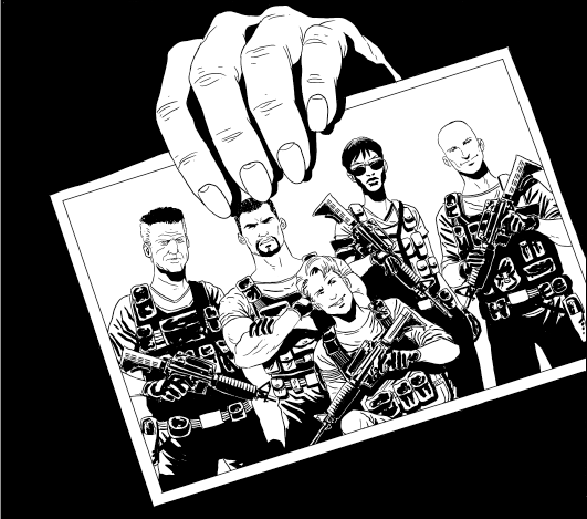
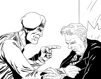
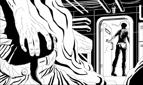
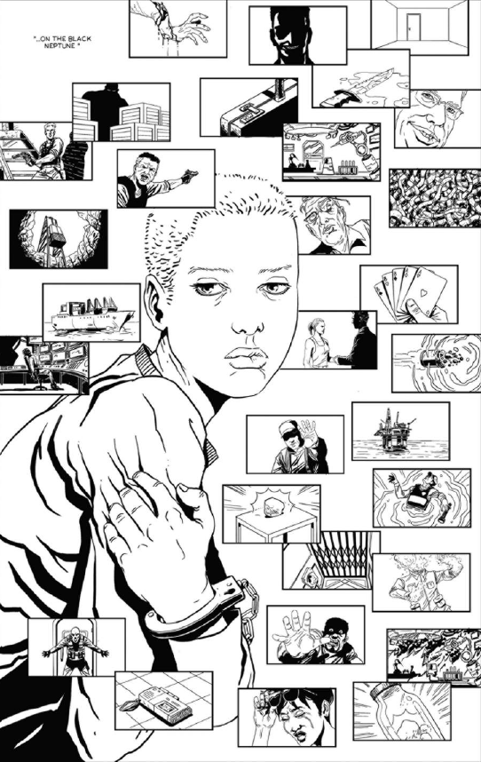
Out of all the books that I’ve had to walk away from, Black Neptune was the hardest. In 2016, Rapha Lobosco and I had been teaming up for a while. We’d put together a few short comics and had notions about maybe slapping them together in a black and white collection. We were doing pretty well out of it too; people seemed to enjoy our collaborations. Still we were both looking for a book that could elevate us a little further in to the industry. Black Neptune might have been that book. It started over beers, as these things often do. I had this idea for a time-bending military-industrial horror that would take place on an oil tanker. It would borrow elements from both the pulp and sci-fi genres and build to a grim nihilistic statement on greed, consumption and the human condition. Sounds cheery right?
We had it all planned out. The narrative was to play out in medias res, using a series of interviews as a framing device for the main action. Through the use of rotating unreliable narrators, the reader would be left unsure as to which of our characters could be trusted. Each of them would have ample opportunity and motive to act in bad faith and betray the mission to their own ends. As we delved deeper in to these interviews more of the corrupt behind-the-scenes influences would be revealed to the reader. The events on board the titular Black Neptune would slip from a claustrophobic, slow-building thriller to a bizarre and gruesome cosmic horror and back again. Reality itself would seem to melt away as the team drew closer to The Mineral. What we really wanted to do was draw the reader into the mental decline of our interviewees. Their versions of events would be challenged, their recollections scrutinised and their perception of reality would be thrown in to doubt as contradictions, lies and the inescapable consequences of greed, corruption and violence were brought to bear mercilessly before them.
Visually I think we were on to a winner. We had to balance the cold and clinical interview scenes with collegial and warm “squaddie banter” during the flashback sequences. To accomplish this we needed striking character designs and to comfortably swing from moody and alienating, to relaxed and professional body language. Rapha’s choice to use heavy shadowing to build the tension, juxtaposed to his crisp line work and sparse backgrounds would allow the reader to focus on the characters and to pick out any break in their artifice. Their attitudes and how they changed when pressured would be vital to the storytelling, more so than the dialogue. Once Rapha started drafting the pages, we knew we were in good shape. The art was dark and moody. The lettering was going to be crisp and clear. The colours were going to shift from a muted noir-influence to a vibrant assault on the senses. We had it all planned out.

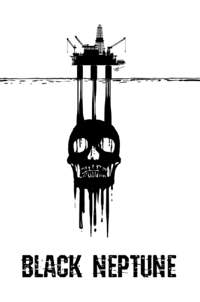
You’ll have to forgive me if I don’t reveal too much of the plot. If there’s one book on this list that I truly think I might take another run at it’s this one. To this day I still look back on the script and my notes on key events and bite my lip in frustration. There really was something there with Black Neptune. I can still hear the character’s voices. I can see key scenes playing out in my mind’s eye. It’s been said that if you want to succeed in comics you need to be willing to kill your babies (no, not actual babies, you monsters), but for me; Catherine, de Souza, Chiaves, Don and Tom are still very much alive. This is however a great example of how a book that seems to have everything going for it can fall apart. We had a great cover. We had finished eight pages and were searching for a colourist. We were even talking about pitching or Kickstarting the book. So what went wrong?
I guess you could say everything kind of went right. While working on the pitch Rapha got some amazing news. He was going to be working on Dynamite’s next James Bond series, Black Box! Sure this would leave Black Neptune out in the cold, but this was what we had been waiting for; the book that would finally bring his incredible art to a wider audience. If anything was going to bring Black Neptune to a screeching halt, I’m glad it was this. We tried initially to work out a way to keep up the progress on Black Neptune while balancing it with the deadlines he’d have to contend with on Bond. Unfortunately this wasn’t tenable in the long run. We both knew this was Rapha’s shot and he had to put everything he had in to it. It was with a cheery resignation over beers, as these things often are, that Rapha told me he’d have to shelve the project, at least until he had finished with Bond. We enthused about getting back to it in six months or so when he’d have the time, but I think we both knew once his art was out there for all to see he’d have no shortage of work.
It was over a coffee, as these things rarely are, those six months on that Rapha told me he’d been hired to draw a Vampirella and Hack/Slash crossover. I knew it was finished then, and I kind of wish we had gone for a beer. But really I couldn’t be happier for my friend.
So here we are at the end of it all, having looked back at four of my biggest failures in comics (so far!). Each of them had potential. Each of them could have made for a good, engaging story. Each of them failed in their own way and for their own reasons. You might wonder why I wanted to share these failures with you or what they have to teach you, and you’re absolutely right to wonder. Not everyone will be foolish enough to try for a labyrinthine OGN right out of the gates. Not everyone will let deadlines and creative frustration be the downfall of a project. And not everyone will have the genuine pleasure of watching their friends and collaborators leave their project for ongoing professional work… but it can happen. Comic projects can fall apart at any stage and for any reason, but it’s so important that you embrace these failures and learn from them. At no stage should you take it personally. At no stage should you let your head go down and your shoulders slump. These things happen. Life happens. You still have your mind and your ideas. There is nothing stopping you from taking up your pen and moving on to the next project.
Though next time you might try for a short, sharp four pages. Maybe.
Keep reading and writing,
-Hugo
PS.
I want to thank Rapha Lobosco, Tríona Tree Farrell, Iuli Niculescu, Matt Shiell and John Quigley for allowing me to use samples of these cancelled projects for this blog. You should check out their work.
Come Away…
Come Away Oh Human Grown…
Published in 2016, Malevolence is a Short Crime/Horror Comic comic following Detective Sykes as he tracks down a suspected murderer across decades.
Script by Hugo Boylan
Art by John Quigley
Colours by Dearbhla Kelly
Letters by Kerrie Smith
Variant Cover by Cian Tormey


Pfew! This has been a manic and hectic couple of months, but here we are again getting set for another wild and wonderful Dublin Comic Con! I’m blasting pop music, running on like… no sleep and haven’t had time to do the process blog I wanted to do, so what the hell, let’s do a rundown of the show!
First up, if you don’t know where the con is, it’s in Convention Centre Dublin (no idea why it’s no called the Dublin Convention Centre, I guess reasons?), and guess what folks? There’s ANOTHER RACE happening right outside the show, making it REALLY difficult to gain access to the Centre from the South Side of the city. At this point I’m fairly certain the council is taking the piss out of us nerds.
Moving on, IF you manage to make it in to the show, I’ll be participating in a couple of panels on Saturday! At 1PM, I’ll be taking part in the Small Press Panel, hosted by the podcaster extraordinaire Wayne Talbot where I’ll be sitting with some of the most prolific voices in Irish Small Press and talking about all of the comics we make and the sleep we lose! Then at 4PM, we have the Writing Comics Panel, hosted by writer-turned-host Seamus Kavanagh, where a group of Irish Comic Writers of varying levels of experience will be sharing their methods and secrets!
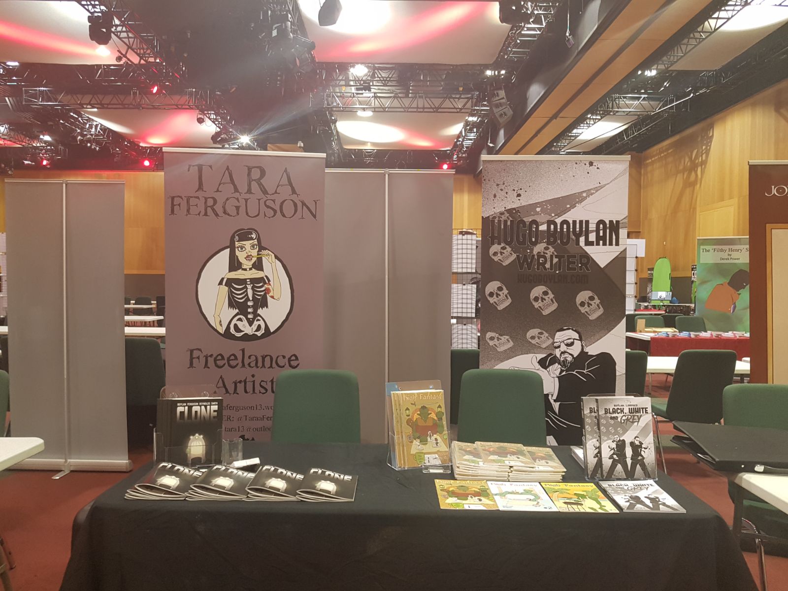
Back to the floor! I’ll be on the Liffey Level (the first floor) at Table L48 with goth-tacular Tara Ferguson! We’ll be exhibiting our new book Clone, which you can see reviewed by ICN and ComixIreland! Suffice it to say that if you like locked room psychological dramas, dealing with panic and the apocalypse, then this is the book for you. Don’t believe me? Have a preview!


And sitting right beside us at L47 is my long time friend and collaborator, John Quigley! John will be selling limited numbers of last year’s award winning collaboration MALEVOLENCE and our newest collaboration, WILL SINISTER! Come along, say hi and buy some good horror, yeah?
Right, I think that about wraps it up… OH! I almost forgot to show you the table!
See you in the morning!
Just a quick update for anyone in Dublin this weekend: Saturday (the 8th of July) is Small Press Day!
I’ll be exhibiting some of my comics along with Kerrie Smith from 11AM until 6PM, in the Fumbally Exchange (5 Dame Lane, Dublin 2) and because this is a celebration of Small Press Comics, we’ve decided to put out a couple of unmissable Small Press Day Deals! (Have I said Small Press Day enough? Do I sound like a TV salesman yet?)
At our table we’ll be exhibiting the award-winning Girls Like You, the not-award-winning Black White and Grey, and the excellent Alterna Comics IF Anthology from 2016! And for the day that’s in it, we’re going to be selling each of these collections for just €10, any two book for €15, or, if like me you just can’t walk away from a ridiculous bargain, we’ll sell you all three book for just €20!
I hope you’ll come along and support the day!


Well it’s been far too long since I’ve updated my website… I guess that means it’s time for you all to enjoy a FREE COMIC!
Well it’s been far too long since I’ve updated my website… I guess that means it’s time for you all to enjoy a FREE COMIC!
If you’ve been following me on Twitter or Facebook you already know that I’ve not been idle all this time, rather I’ve been doing a lot of writing and there will be more on that soon, but not today. Today is all about Death by Service. I’d love to say that Death by Service started life as an ambitious thought experiment on the disposability of human life, the hazards of war, and the prison industrial complex. I’d love to say all that, but while it might have become that after many hours staring at a computer screen and a scribble-filled A4 pad DbS was really born out of my own frustration with another short comic script that wasn’t working. At all.
I wanted to deal with war, yes, and the disposability of human life, but I couldn’t reconcile those themes with my story, my vehicle was broken and I needed a lot of new parts to make it go. Rather than continuing to work on a script that wasn’t going the right way I shelved the project and cannibalised some of the more enticing ideas and used an interesting frame to bring the whole thing together in DbS. What resulted was one of my tightest scripts to date, and a story I feel is up there with anything I’ve put out so far. Saying more would spoil the comic, so I’ll just shut up but in the mean time I’d just like to take a moment to praise Ahmed Rafaat for not only his excellent artwork, but his incredible, infectious enthusiasm for this project. He approached the script with a energy that translated on to the page and brought a great liveliness in the art and storytelling to an otherwise morbid story. I can honestly say he gave it his all and was never shy to suggest a way to improve the pacing of a scene.
OK that’s more than enough from my head.
Art by: Ahmed Rafaat
Letters by: Kerrie Smith
Script by: Some guy
")
")
")
-V2")