Perfection calls to you
Script by Hugo Boylan
Art and Colours by Lane Lloyd
Letters by Kerrie Smith


It might break you for a while.
Perfection calls to you
Script by Hugo Boylan
Art and Colours by Lane Lloyd
Letters by Kerrie Smith
Before we get in to it, LAD has gone live on Kickstarter! I’m going to talk a lot about editing in the context of this book, and it would be amazing if you could take a minute to check out the page, or maybe even pledge some of your hard earned cash so we can make it happen!
In the summer of 2018 I sat down with a checklist of books I wanted to make, people I wanted to work with and shows I wanted to attend. It was a daunting list. The two books at the top of that list were with the same artist, and would undoubtedly be an incredibly draining process for both of us. Not the collaborating, the artist in question is an utter joy to work with (and we’ll get to that later), but the process of writing two vastly different mini-series, for demographics that couldn’t be further apart, each dealing with themes that were definitely going to be a gut-punch for me to revisit. I decided to take a year, neglect this website, take sporadic breaks from social media, cut down my convention list to “special exceptions” (shows like Small Press Day, ComicCity and Cork Comic Expo; the shows that I love because they’re a little different) and decided to clear the scripts for those two series and that would be it. If I made any other comics, or posted any other stories, it would be for the love of the medium, and it would be short.
Right at the bottom of this list, I’d scribbled in a little note for myself: “Umar?“
For a couple of years now, I’ve been following Umar Ditta’s work. We became friends, I look over his early drafts sometimes and give little bits of feedback where I can, and he’s done the same for me. Comics are weird like that. I wanted to work with Umar. His capacity for coming up with energetic and weird ideas knows no bounds, and his dialogue can leave you with a tear in your eye, or have you cry laughing, so imagine my surprise when he sent me a very raw draft for what would become LAD: The Homecoming. Here was a story that was as brutal and visceral as the short stories I keep in a folder on my computer that nobody will ever see. It managed to balance cutting cynicism with sly wit in a way that was just crying out to be turned into a comic, now! This was a book that I wanted to read, but like I said it was raw. The draft I read was packed with caustic dialogue, mind-blurring imagery but moved like a freight train with a blink-and-you’ll-miss-it series of scenes and character moments. Another set of eyes would only improve this narrative, right? Before I could even chance my arm, Umar offered me the editing gig.
LAD has changed a lot from that raw draft. What was initially a jam-packed 24 page eruption of violence, intrigue and distressing surrealism became a 3 issues of careful character development, the implication of danger and some genuinely inspired visuals. So how did we get here?
When editing a Comic Book, it’s not uncommon to be in fairly regular contact with the team, and after sending Umar my initial notes on structure and pacing, we spoke a little bit about how he wanted to tell this story, and how he wanted to effect the reader. These conversations took place over email, messenger apps and eventually, an outline was put together, giving an elevator pitch, and a summary of each issue – as a quick aside, although these summaries did work as a valuable road map for the series, and have helped us to stick to a deadline and work towards the ending with every panel, no battle survives first contact, and comics are rarely the exception. Once I had reviewed this document, I made notes, adding them to the footnotes section of the relevant page for easy reference, and wrote a few short paragraphs of feedback under each issue.


This can be a surprisingly fast process, and in the case of LAD, I was looking at the first working draft of Issue 1 in about a week. Once I have the script in front of me, I’m able to do the basics (like reading it, natch), checking the dialogue (making sure it all flows well and fits in each panel without overwhelming the page), panel counts (how many panels are on each page? Is there good variety?), action in each panel (making sure single characters aren’t performing multiple movements in a panel description is a must!), clarity for the artist and letterer, mapping out page turns, all that good stuff.
LAD has undergone one main change from the initial draft to the working version we used to make the first issue of the comic. As I’ve mentioned before the raw draft of LAD had a lot going on – too much to really allow the characters to breathe. In order to combat this, a full story pitch was laid out, highlighting the necessary action in each issue. When we had this in front of us, Umar and I were able to discuss at length how to improve the pacing of the issues. The answer was fairly simple, open hot and spread the story beats over multiple issues. In addition to this, in facilitate running multiple narrative’s simultaneously, Umar added a “cold open” to the beginning of each issue, focusing on a character or action that will prove important to the plot later on. Below are the original and current drafts of LAD Issue 1. Although we managed to reuse most of the original opening scene as the titular Lad’s introduction later on in the book, it’s interesting to think that adding a full scene to the start of the issue actually managed to improve the pace of the story.


After reading the script and making some notes for myself, I then make notes on each page for how the writer might change the panel descriptions and dialogue to give the artist a better idea of what they have in mind. Below is an example of what those notes looked like on an early draft of Page 1. 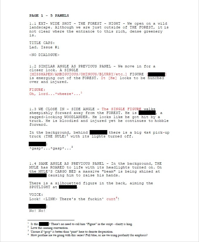
In my notes above, I suggest that the writer name THE SINGLE FIGURE immediately after introducing him in the script. It’s always best when working with a team to have as clear an outline of what’s happening in the script, even if that makes some of the panel descriptions run long. While it’s not likely to happen, the artist may end up redrawing an entire panel if they initially outline the wrong SINGLE FIGURE, or they may end up working from the wrong character design. What’s more likely to happen however, is the letterer (who is typically the last person in the chain when in comes to comic making), already pressed for time will have to double check they’re lettering the correct character. That’s not ideal if you’re under pressure to meet a deadline.
On a project like LAD where the writer is also the publisher, most of my notes can be taken as suggestions. When working as a professional in the industry, the editor usually has final say on what stays in the script, but at the independent level there’s far more discussion and collaboration. Fortunately Umar and I tend to get on the same page quite quickly, and for the most part I find when he chooses to go against my notes, it’s with good reason (and often to build to a killer line from my favourite character in this series, First Cousin). Sometimes a suggestion from an editor can lead to a much better choice from the writer, as seen in the dialogue change in Panel 5 of Page 1.


This process is repeated through multiple drafts, until both writer and artist are satisfied. It should be noted, if you’re working to a tight deadline, or on multiple projects, going through too many drafts can be strenuous for both writer and editor, and that’s why having a solid outline and issue breakdown is vital to ensuring you’re always working towards the same goals and the betterment of the book.
Comics are a visual medium, and with a book like LAD, that balances dark and moody shots with mind melting surrealism, you need to find an artist who can bring out the best in the script while adding their own unique voice to the narrative. Our search for the perfect artist was exhaustive. Umar put out a call for portfolios on social media, I scouted friends and past collaborators to see who would suit the book and how they would approach it. This was honestly the most difficult stage of creating LAD for me. When all was said and done we were down to two artists. One, an exciting, dynamic and smart cartoonist, with a style that can range from Saturday morning, to Adult Swim, and the other, a methodical and experienced comic book artist with a wide rage of styles, a focus on expressiveness and aggressive inks. I think narrowing it down aged me five years, but in the end we went with Carlos Pedro.
Carlos had just (and I mean earlier-that-week just) finished the inks on a book he and I had planned to pitch later this year when I mentioned that Umar had a great script that I was editing. Carlos wanted in. He has been a supporter of Umar’s for a long time, and once he saw the script, he wanted to be the one to draw it. Before he touched his first layout, he treated us to his vision and concepts for the book.


And what he envisioned for the characters.


The design work on the aesthetic for the book and the characters took Carlos about two weeks, while receiving feedback first from myself as an editor and after I approved of an image, it was sent on to Umar to give his final nod as the publisher.
Editing for the artist works in a very similar way to how it does for the writer, with a few notable differences. The first, naturally, is that you’re dealing with images instead of words. While this might seem like a small enough thing when it comes to giving feedback, it is vital to ensure there are no mistakes in simple things like spacing in the panels and dialogue order (the first speaker is always on the left) in the layouts/thumbnails stage. One small miss here can literally make the letterer’s job impossible and cause massive last minute rewrites to a finalised script to avoid huge delays and a massive headache for the artist who could have to redraw and entire page. It’s not uncommon for my first reply to Carlos when he asks for feedback on a new layout to be “how’s the dialogue order?” or “have you accounted for dialogue?” I’m lucky that Carlos is a meticulous planner and can generally be relied on to answer “of course”. From there I check for aesthetics and storytelling. It’s important that the page structures aren’t too samey as you read a comic. Unless it’s done for a narrative purpose, it runs the risk of boring the reader. The same is true of “shot” choices. If every panel is a middle distance shot of a character doing something while talking, it can become a very tedious read, however good the writing or art may be. Below is a process from sketch to finished page that Carlos worked on with my feedback.


")

")


")
")
While it’s not typical in comics for an artist to send this many steps through to an editor, as Carlos and I have worked together for a few years at this point, we’ve worked out a method that works for us. Typically on the steps in between the blue line sketch and finished pencils, I would give general feedback on character placement, movement or expressions in one or two sentences. Beyond that my function is pretty much one of a cheerleader until we reach the final pencils. This is the last point for any effective editing to be done when working traditionally (paper, pencil and ink). Once the ink touches the pencils, that’s it, so if there is anything that really stands out as not working in the pencils, or that might not work when inked, I’ll bring it up here. Fortunately, Carlos works digitally. This means that changes can be made well in to the inking stage, and while this rarely happens (it’s good to get in to the habit of editing at the layout stage, and having a final proper look at the pencil stage), it is nice to have that breathing room.
There are very few occasions when I will push back against a page. Fewer still when it comes to a splash page, but when it came to the title page for LAD, Carlos and I struggled to click.


The first point of contention was whether or not it would be too on the nose to have Lad smoking, under a “No Smoking Sign”.

What about his body language? This is our first introduction to the title character, and we wanted to capture him perfectly. Should he stand with his hands in his pockets or lean against… that bloody fence (I was very against the fence).


Finally (and I mean finally, I think poor Carlos may have spent more than a day trying to get my idiot editor brain to understand that leaning was in fact the correct body language to capture Lad’s overall demeanour, while still introducing what is to be a pretty intense scene), we settled on cutting the “No Smoking Sign” (boo) and to show Lad leaning (yay) against a post while smoking.
(And yes, I know the “No Smoking Sign” would have been on the nose, but out first introduction to Odysseus in the Odyssey shows him weeping openly on a beach, devastated by the separation from his wife, brushing aside his own infidelity in that instant to allow the readers to feel an immediate sympathy for him, so yeah, it could have been fine, OK?)


Once we were agreed on what our title page should look like, Carlos set to work inking what I think my be my favourite expression of Lad’s in the entire comic.

")
")

While this process may seem like a long one, my role is generally to catch any glaring storytelling mistakes that the artist may miss while they’re in the zone and focused on making the best looking page they can. Arguments like the one highlighted above could only really happen when you work with someone as much as Carlos and I have, and are both fighting to make the best book possible.
As I’ve mentioned before, the letterer is typically the last team member to get to work on a page, and they’re usually the one (Carlos not withstanding) an editor will have the most contact with, barring the writer in the early stages. When deadlines are approaching, you want to make sure everything is OK, and more importantly, you need to keep the line of communication open between you and the person whose work will be the first thing a reader sees when they open up the comic to any given page.
I’m in the habit of keeping letterers in the loop from day one. I want them to have access to the final pencils and inks as soon as they’re approved. Even if they have to wait for colours to begin actually lettering the page, having the page laid out in front of them allows them to do any preliminary work they might have to do. This is doubly true for the letterer on LAD, Kerrie Smith – we share an office.
When starting a new book a letterer will first try to match a font and the weight of the word balloon to the art and inking style. They may also consider the type of story it is. For LAD, a happy-go-lucky, or overly rounded font wouldn’t fit the tone of the book, while the crooked font Kerrie went with here works a treat.
When choosing the right font and balloon weight, the letterer may send a few samples to the editor, writer, artist or the team in general to feel out the room and narrow their final choice down. Once a font is selected, they will set to work on lettering the page, being sure to guide the reader’s eye from panel to panel, while trying not to obscure anything important in the art. This can be extremely challenging, and it’s not unusual for the editor, artist or writer to ask for fixes to be made before going to print. Unlike scripting and art, there are no “rough drafts” for lettering once the font and balloon styles have been selected, so it’s vital for the writer to be clear in the script with how they want a scene to read, and if there are any important objects in the panel that cannot be obscured. It’s unusual for letterers to be paid a second time for doing corrections that have been requested by another member of the team, so it’s important to remember that every time they have to rework a page, a panel, a scene, or in some cases a whole comic, they might just be working for free.
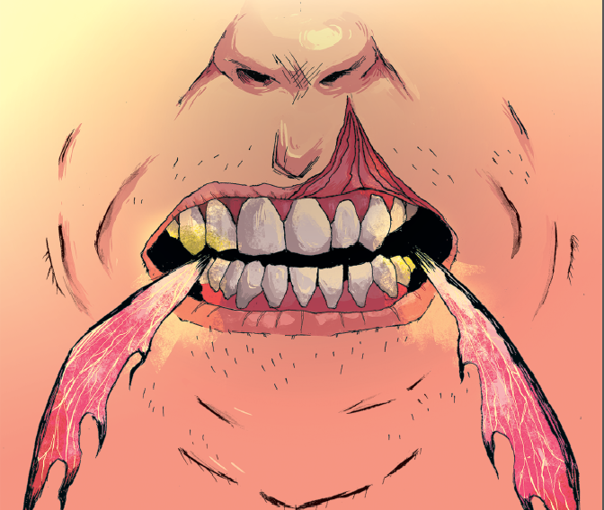
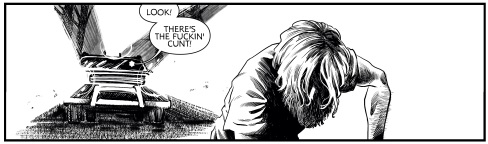
Fortunately this is rarely the case for me when I work with Kerrie. We do share an office after all, and it’s common practice for her to bring any concerns she has about the script or pages to my attention long before she starts work. This way we can determine what (if anything) has to change or be rewritten to make sure the pages will still look their absolute best once all of the writing is in place. When working on LAD, we did have one instance where a page had to be re-lettered before going to Kickstarter. After seeing all of the pages with all of the lettering in context, Umar realised that Carlos’ artwork for that page was dramatic enough to stand with minimal lettering. The original page featured a line of dialogue “Oh lord… <wheeze>…” followed by THE SINGLE FIGURE “gasping”, or “panting”, and a final exchange with THE SINGLE FIGURE shouting “Oh heaven’s above! Save us!” only to be answered by “Ya no getting away ya daft prick!”. After seeing all of this on the page, the writer felt (correctly) that the scene would flow better with less dialogue. Unfortunately, the original image that was featured on the LAD Kickstarter Page before being replaced has been lost. There was however still a discussion to be had about whether or not THE SINGLE FIGURE’s gasps and panting should be vocalised.
")
")
")
Ultimately, Kerrie felt that while dramatic, having THE SINGLE FIGURE vocalising so much would detract from the tension of the scene and suggested a solution that would become our final choice for Page 1, removing all but the pursuers aggressive proclamation of “there’s the fucking cunt”.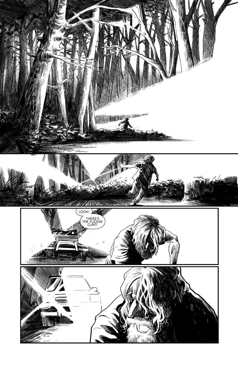
Ultimately when editing for comics, your jobs is to facilitate the other creators and to foster an open line of communication between all parties. Yes, you proofread scripts, you check for the quality of storytelling and pacing on the page. Yes you have to make sure the artist leaves room for the letters, and that the script isn’t overburdened with dialogue that a letter will then have to cover the art with. If a comic calls for colour, you need to make sure the colours work thematically and that the script details the time of day (so very important). Yet with all that said, you still have to focus on deadlines, production and communication. If any of these break down, it’s not the fault of the team member who has fallen behind or failed to respond to an email, it’s on you to make sure if there are delays, and nobody down the chain can help catch it up, that the deadline is moved, that everyone feels like they have a voice and can voice their opinion and most importantly, it’s on you to make sure the final product that makes it to print is the best version of that story.
Well, to find that out you should check out our Kickstarter Page!
But I guess I can give you a little taste here before you do:
Taking inspiration from neo-noir films and comics, Lad is set in a world that is similar to ours but yet feels hauntingly different.
The Family conduct their criminal activities from the Beacon Lodge. They have been for a while and everyone one knows that the town belongs to The Family. There is however one place where no Family Member would dare set foot: The Forest.
Engulfing most of the town’s perimeter, The Forest is home to a mysterious entity known only as The Hermit. For as long as Lad can remember there’s been one mantra in The Family: leave The Hermit alone and The Hermit leaves The Family alone. So why was Dad, the patriarchal leader of The Family found savagely beaten and barely clinging on to life just outside The Forest?
In The Family’s eyes this is an act of war. An act of war that sets in motion a series of events that will change everything for Lad, forever.
And did you know that some of your favourite comic creators love LAD?
“A bleak and bloody British revenge thriller in the proud tradition of ‘Get Carter’ and ‘Dead Man’s Shoes’. Unmissable.” Alex Paknadel – Friendo, Arcadia, Kino
“After ‘Untethered’, Umar Ditta goes from strength to strength with ‘Lad’, a level-up showing from everyone involved.” Fraser Campbell – The Edge Off, Alex Automatic
“I love all of these people, so for them all to get together and produce something less than incredible is inconceivable” PJ Holden – Judge Dredd, Terminator/Robocop: Kill Human
“Taking distinctly modern street violence and merging with old folkloric horror mode is just inspired, and it looks brutal in every way.” Kieron Gillen – The Wicked + The Divine, Die
“A dark, urban fantasy with a thick layer of grimy menace.” Dave Cook – Killtopia, Vessels
“Carlos Pedro is always an artist to watch, upping their game with each new project. Here he is, yet again, bringing something exciting and new, his noir lighting and textures a perfect compliment to Ditta’s narrative in Lad.” Hassan Otsmane-Elhaou – Panel x Panel, Strip Panel Naked, Killer Groove
“Everything I’ve seen of Lad is fascinating. So far it’s a strange, sideways item, all gorgeously creepy shadows and little moments of nasty, just beginning to fold together into something deep and disturbing. I want more – you should too.” Al Ewing – The Immortal Hulk, You Are Deadpool, Loki: Agent of Asgard
For a full 5 Page Preview of LAD head on over to the Kickstarter Page now and let me know what you think!
Keep reading and writing… and drawing and lettering… and colouring and designing… and marketing and budgeting… look just keep up the good work everyone!
Hugo
Come Away…
Come Away Oh Human Grown…
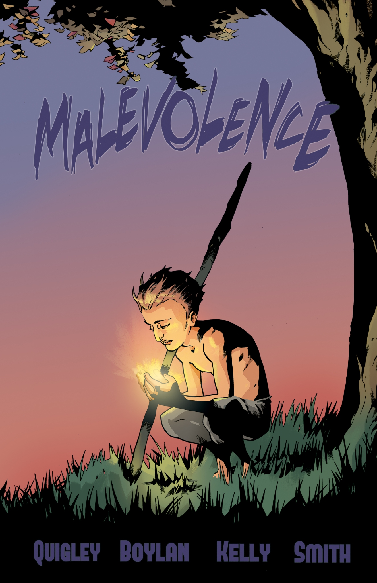
Published in 2016, Malevolence is a Short Crime/Horror Comic comic following Detective Sykes as he tracks down a suspected murderer across decades.
Script by Hugo Boylan
Art by John Quigley
Colours by Dearbhla Kelly
Letters by Kerrie Smith
Variant Cover by Cian Tormey


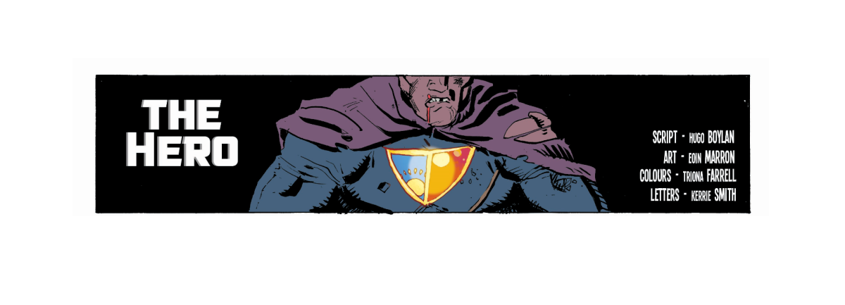
It was around this time last year that Eoin Marron and I began to put together an outline for what was to become the Hero. I’ve spoken about the Hero already, so I’ll keep this short so you can get right to the comic. At the time all we really knew was that we wanted to do a short action piece with a twist ending. We’re both readers of 2000AD and both fans of the Future Shock so it seemed like a perfect fit.
Somewhere between our deciding to work together and my starting the script, Eoin got a pretty cool internship, and darnit all if that didn’t push the man to overhaul the layouts and designs and put together a excellent comic! See that last panel, that very last panel right there at the end? All Eoin.
We were lucky enough to have approached Triona Farrell at the exact right time, with a reasonable enough deadline that she was able to take on the project, and really turn her colours to the storytelling. I believe her first comment on the inks was “this is going to be pinker than you’d expect”, before proceeding to explain a whack of colour theory that pretty much resolved any issues I could have with her pallet choice and storytelling. I think she did a brilliant job, and it broke my heart that this short first saw publication in greyscale.
I’d be remiss to not mention Kerrie Smith who not only lettered the comic and designed the logo but also prepared the final files for both print and digital distribution. I work with Kerrie on quite a few projects and I’m always impressed at how she changes up her lettering from project to project to suit the line-work and colours.
Right so, that’s enough from me. Enjoy the Hero!


WOW this year tore in at breakneck speed and here we are already staring down the barrel of another Thought Bubble… I am exhausted!
To provide just a pinch of context here, Thought Bubble is one of the big ones for anyone making comics in the UK and Ireland. It’s a huge show with incredible guests, great exhibitors and some of the most enthusiastic, knowledgeable and fun fans around! It’s the convention that I use to bookend my year and I always like to try and do something a little special for it!
If you’re on the fence about attending Thought Bubble, jump off that fence, book a hotel in Leeds and fly, drive, bus, train, sail, ferry or swim over! It’ll be well worth your time. It’s brilliant! 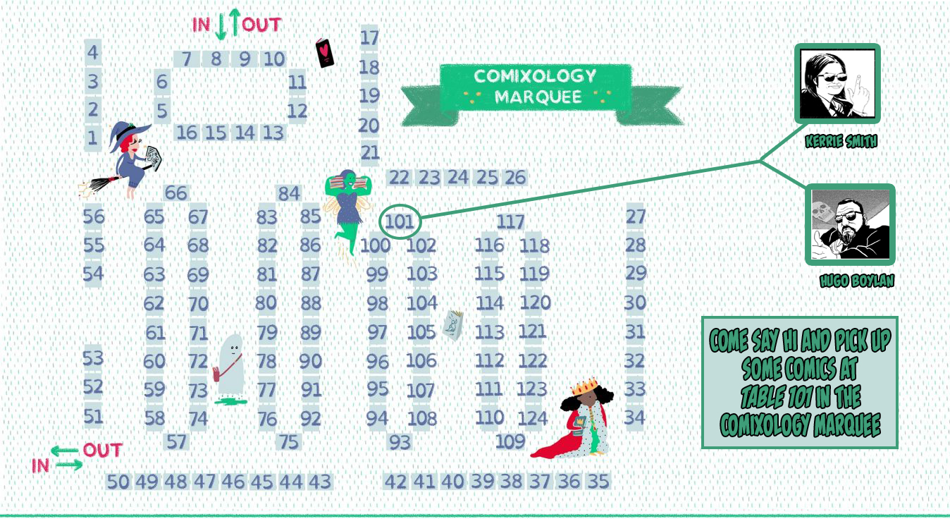
This year I’ll be returning to the TB Marquee with my long time partner in crime Kerrie Smith! You should come over and say hi, and maybe even buy some comics… please buy some comics.


I’ve already spoken about BLACK, WHITE AND GREY, and you can see a full preview of it here, but that’s not all that’s coming to the big tepee this year! MALEVOLENCE has been receiving some exciting critical buzz since we launched it back in August, and we figured for our second printing, we’d make a few small changes. Mostly on the writing and lettering end, but we have made one exciting addition that I think you’ll want to get your hands on ASAP!
This excellent variant cover by Cian Tormey, with colours by Dearbhla Kelly will be available for the first time at Thought Bubble from Table 101 in the Marquee! Be sure to get there early if you fancy a copy, as we’re only bringing a limited stock to the show!
If you miss your chance to pick up the Tormey/Kelly variant cover, we’re also going to be bringing copies of the first printing with the original cover, so don’t worry, you’ll still have your chance to get your hands on this horrific short crime story!
Making their return to the Marquee this year are limited copies of SUPERHERO HELP DESK SEASON 1: BIJILICKERS! and Kerrie’s award winning GIRLS LIKE YOU! Again, we’re bringing a limited stock, so if you’re dying to have a little more Super Office Action or Feminist Short Stories in your life, be sure to get to us early and we’ll hook you up!


Finally, if you’re at Thought Bubble and feel like picking up some more Irish comic books, I should recommend PROJECT CROSSROADS by Seán Hogan. I could go on and on about PROJECT CROSSROADS, and the short I wrote for it “Ducksworth’s Last Stand” but for now what I’ll say is, you can find Seán in the Royal Armouries Hall at Table 37, and you should most definitely pick up a copy!


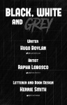
I’m delighted to announce that Rapha Lobosco and I will be collecting our short comics in one shiny collection at Thought Bubble! With letters and book design by Kerrie Smith, BLACK, WHITE AND GREY promises to deliver some strange and thoughtful stories!
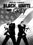
BLACK, WHITE AND GREY collects the critically acclaimed MURPHY’S DAY, the award-winning HEAVY BLACK, the action packed DAY JOB, a brand new short story DREAMWEAVER and as a bonus a preview for a new Graphic Novel BLACK NEPTUNE.


One final thank you has to go out to Comic Printing UK for their outstanding customer service, this book may not have come together without them!
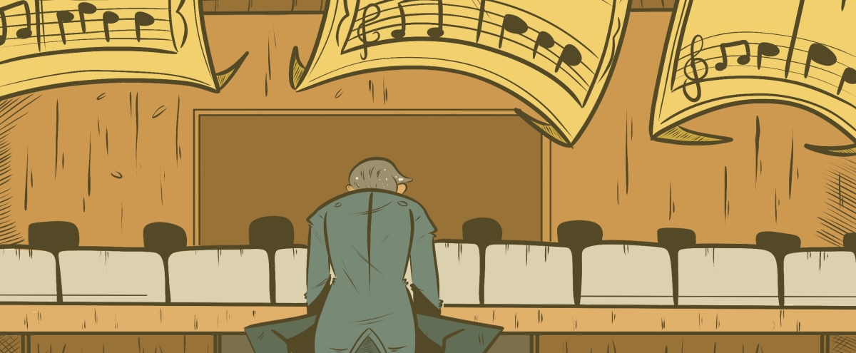
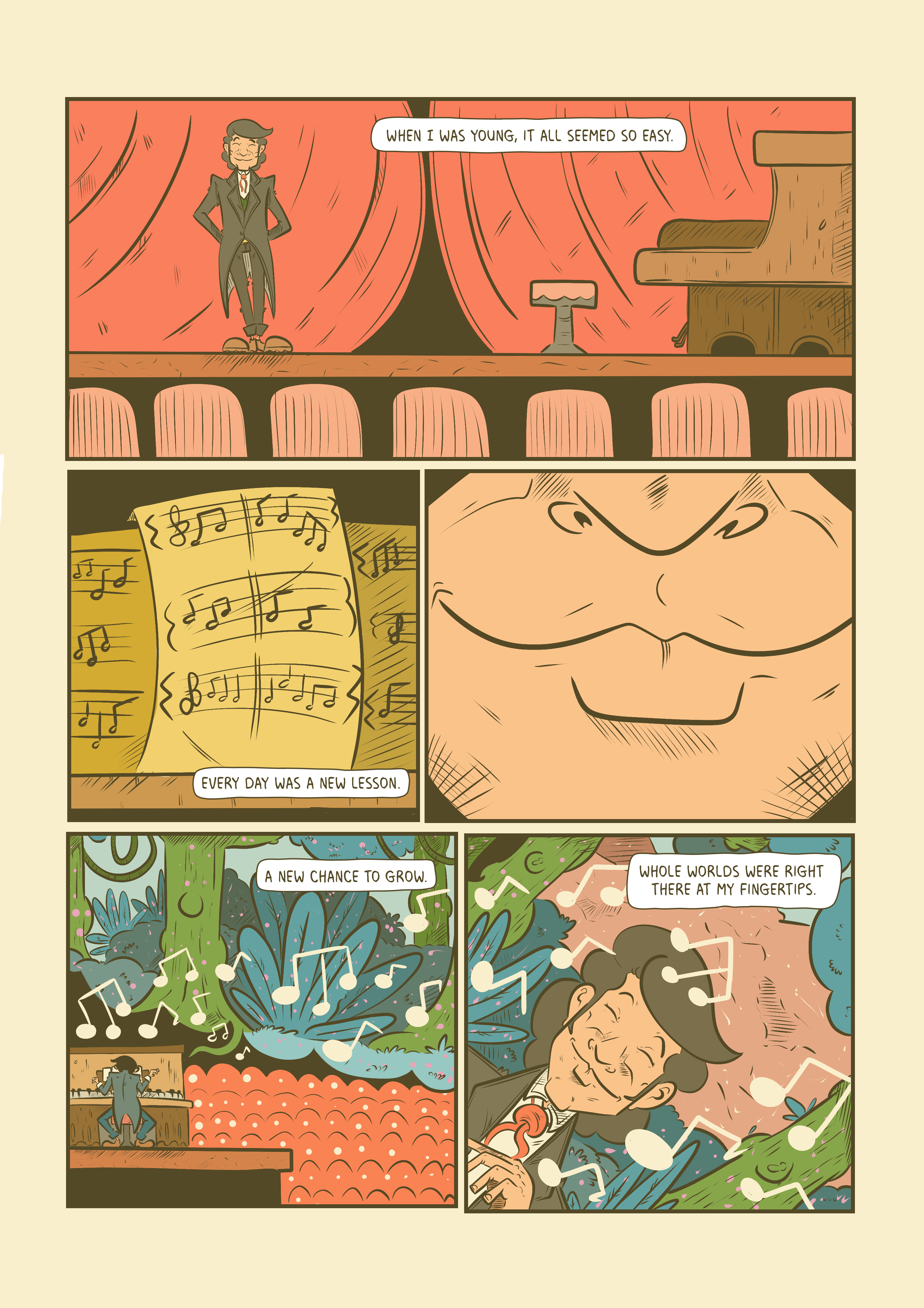
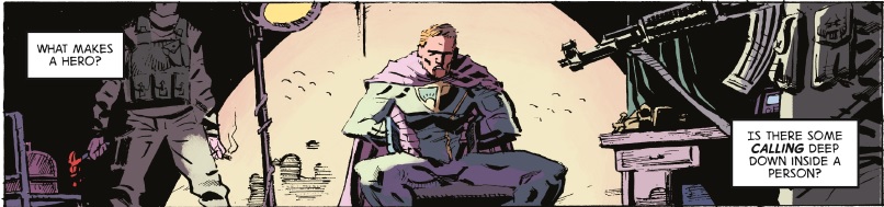
The Hero is a short comic to be published by Alterna Comics in their upcoming IF Anthology.
With art by the excellent Eoin Marron, colours from the always exciting Triona Farrell and letters by the tireless Kerrie Smith, the Hero is a 4 page comic that asks the question, what makes a hero.
When we sat down to discuss our first collaboration Eoin and I had the very loose idea to make a short comic with a twist. Beyond that, Eoin knew he wanted to see the comic in colour and his first choice for colourist was Tree. Somewhere between agreeing to work together and approaching Tree to lend us her pallet, I started obsessing over the role of the “hero” versus the “protagonist” and got an image stuck in my head of a classic superhero being held captive/interrogated by a paramilitary group.
After bouncing ideas around for a little while, we settled on fast paced action piece that would allow us to examine the idea of the hero while building to a twist we could both really enjoy. I won’t go in to too much detail right now, but you should check out the comic to find out more!
In a strange twist all its own, the Hero was fully illustrated, coloured and lettered before we were made aware that the IF Anthology was looking for submissions for superhero stories. This presented us with a very real problem; the IF Anthology is printed in black and white, while the Hero was always intended to be presented in full colour. This was more than a little heartbreaking. Tree’s colours are excellent and deserve to be highlighted, but the IF Anthology seemed like the perfect home for the Hero. Although we agonised over the decision to pitch to Alterna and risk losing a key part of our story in the end we agreed to use Tree’s grey scale shading to bring the inks to life, and trust me they really do come to life! Still, one day soon we’ll get the full colour edition out there!


The IF Anthology features the work of 96 creators over 40 unique and challenging stories and includes the Irish made stories,”Gravity” by writer and letterer Kerrie Smith and artist Hannah Deacon, “We Can Be Heroes” by writer Darrin O’Toole, artist Barry Keegan and letterer Dee Cunniffe, and of course, “the Hero” which you’ve been reading all about.
You can pre-order your copy through the IF Anthology Kickstarter Campaign today!
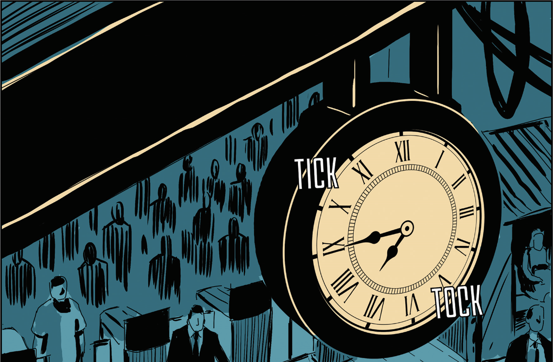
Scripted in 2015, for issue 7 of Lightning Strike Presents, Murphy’s Day follows the story of a man whose day is falling apart around him.
I wanted to do something a little different with this script. To this point in my comic making my focus had been on using dialogue and captions to tell a story. I’ve always found dialogue to be the part of writing that comes most naturally to me, but in my mind comics can be about so much more than just the dialogue. For Murphy’s Day I stripped all of that away to present a mostly silent script (the exception being the constantly ticking clock and buzzing phone). I wanted to create a short comic that would invite the reader to give it a second or maybe even a third look, and so I played with the space on the page too, counting down from 10 panels on page 1 to 1 panel on page 10. I’ll go in to more detail of why I wrote the script the way I did, and how the artist and letterer on the book managed to make it all flow together and improve on my script in a later blog post. Maybe…


First Published in Lightning Strike Presents Issue 7, Murphy’s Day tells the story of the day everything went wrong for the titular Murphy.
Murphy’s Day was an exercise in storytelling and using a comic book format in an interesting way. To this day I believe it remains one of my better scripts and it doesn’t hurt that Rapha’s art and storytelling is just really lovely!
I hope you enjoy it!
Art by Rapha Lobosco
Letters by Kerrie Smith
Script by Hugo Boylan


Keep an eye on the site for updates on this one folks, I’m hoping to post the full script later this month.
Heavy Black was originally scripted in early 2014 as a writing exercise.
Titan Comics had put out a call for 6 page stories dealing with a “lost in space theme”, and that struck me as a great opportunity to play with monster horror and to work on rapid tension building.
In 2015 comic artist Rapha Lobosco approached me for script samples to practice on. He took to Heavy Black and asked if we could produce the short comic for that year’s Comic City Festival. The final edition of Heavy Black deviates from the script in a few ways. For example, we felt that a seventh page would allow for the gravity of Charlie’s decision to stick with the reader. There are several other small differences between the finished product and the script (revealing Charlie’s face immediately and ditching her plasma torch early on being two of the most prominent), I find this is a normal teething process for any collaboration. A script should inspire an artist, not dictate to them.
Script by Hugo Boylan
Cover art by Manny Clark
Letters by Kerrie Smith